Crying Wolf on (Hyper)Inflation?
[This article is part of the Understanding Money Mechanics series, by Robert P. Murphy. The series will be published as a book in 2021.]
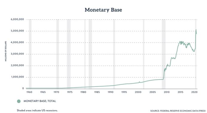
In chapter 10 we explained the connection between monetary inflation and price inflation, and warned that there is no simple one-to-one relationship. This fact has been very relevant in the wake of the various rounds of quantitative easing (QE) that the Federal Reserve implemented after the financial crisis of 2008. The following chart shows the huge increase in the monetary base since 2008:
In the early years of QE, many economists—including the present author1—warned that the Fed’s unprecedented monetary inflation would cause a significant increase in consumer prices. Some pundits went so far as to warn of actual hyperinflation, reminding Americans of the terrible experiences of Weimar Germany and modern Zimbabwe. Yet years passed by without the “inflation time bomb” exploding. This led the proponents of the Fed’s policies to mock the warnings as crying wolf.
In this chapter, we’ll assess several popular explanations for why the Fed’s monetary inflation since 2008 hasn’t generated a comparable increase in price inflation. Because this book is intended to be educational rather than polemical, we will merely mention some of the pros and cons for each possibility, rather than arguing which are correct and which should be rejected.
“The government’s CPI measure vastly understates price inflation.”
The benefit of this type of explanation is that it focuses proper cynicism on data produced by government agencies, which are not renowned for their unwavering devotion to truth.
However, the problem with this explanation is that many critics of QE were warning of significant price inflation that could not have been hidden through statistical tricks. Americans were able to fill up their vehicles in 2010 (say) and for most drivers the price was $3 or less per gallon of gasoline. If some of the more serious warnings of price inflation had proved correct, this would not have been possible.
Keep in mind that the official government measures showed twelve-month CPI (Consumer Price Index) inflation hit a whopping 14.6 percent in March 1980. Had the government told Americans at that time that inflation were under 2 percent, it would have been an obvious lie. So although the conventional measures may be significantly understating the rising cost of living since 2008, the mismatch between the extreme warnings and reality can’t be explained entirely by reference to data fudging.
“Inflation won’t be a problem while we still suffer from an output gap / idle resources.”
According to both Keynesians and proponents of MMT (modern monetary theory), increased government spending—even if financed by monetary inflation—won’t generate large increases in consumer prices so long as the economy is operating below its capacity. In more technical terms, they argue that so long as real GDP is below potential GDP, increases in nominal spending serve to boost real output rather than prices. The intuitive idea is that the unemployed and other idle resources will absorb new spending first, before tightening labor and resource markets cause wages and other prices to begin rising.
On the plus side, the Keynesians and MMT camp were correct when they said the various rounds of QE since 2008 would not cause extreme price inflation, let alone hyperinflation. Since some of their opponents did predict such a result, the Keynesians and MMTers can understandably claim vindication.
However, there are numerous problems with this explanation. For one thing, the Keynesians didn’t merely predict a lack of significant price inflation; many of them predicted price deflation. For example, Paul Krugman in a blog post in early 2010 posted a graph of collapsing CPI inflation, warned that the disinflation could soon turn to outright deflation, and ended with, “Japan, here we come.”2 (Japan had experienced sustained reductions in CPI.)
Five months later, Krugman admitted that the standard Keynesian tool of the Phillips curve—which models a tradeoff, at least in the short run, between unemployment and (price) inflation—hadn’t worked so well in the aftermath of the financial crisis. As Krugman acknowledged in a post entitled, “The Mysteries of Deflation (Wonkish),” coming into the Great Recession, “the inflation-adjusted Phillips curve predict[ed] not just deflation, but accelerating deflation in the face of a really prolonged economic slump” (italics in original).3 And since that hadn’t happened, the Keynesians too had to tinker with their model in light of reality. To generalize, in 2009 the conservative economists had predicted accelerating inflation, while the progressive economists had predicted accelerating deflation.
Another serious problem with the no-inflation-until-full-employment doctrine is that it was disproved in the so-called stagflation of the 1970s. The Keynesian mindset of the postwar era had originally led policymakers to believe that they had to choose between either high unemployment or high inflation in consumer prices. It should not have been possible for the economy to suffer through both evils at the same time.
And yet, once Richard Nixon killed the last vestiges of the gold standard in 1971 (which we explained in chapter 3), the remainder of the decade saw unusually high levels of both. For example, in May 1975 the unemployment rate was 9 percent while the twelve-month change in CPI was 9.3 percent. In light of the US experience of the 1970s, simple rules such as “the economy can’t overheat while there are still idle resources” can’t be the full story.
“Yes, the money supply increased dramatically after mid-2008, but the demand to hold it increased as well.”
On the plus side, this explanation is necessarily correct; every fact about prices can be handled in a supply-and-demand framework. The “price” of money refers to its purchasing power; how many units of goods and services can a unit of money fetch on the market? If we hold the demand for money constant and vastly increase its supply (through rounds of QE, for example), then the “price of money” falls, meaning the currency becomes weaker, meaning that the prices of goods and services quoted in that money go up. This is of course just another way of describing price inflation.
However, in practice other things might not remain equal; the demand for money might increase too, especially during a financial crisis. Remember that the “demand to hold money” isn’t the same thing as a desire for more wealth. If someone has (say) $100,000 in liquid wealth, it will generally be diversified among several assets, including stocks, bonds, precious metals, life insurance, cryptocurrencies, and some in actual money (whether literal cash on hand or money on deposit in a checking account). During times of great uncertainty, the advantages of holding actual money become more important to many people, and so they adjust their portfolios to hold a greater share of their wealth in the form of money. This is what it means to say the “demand to hold money” increases.
After the fact, because we didn’t observe an unusual drop in the purchasing power of the US dollar from 2008 onward, we can confidently say that the demand to hold US dollars increased to offset the increase in US dollars orchestrated by the Federal Reserve. This is necessarily true.
However, the downside of this explanation is that we can only be sure to apply it correctly in hindsight. If we want to assess what will happen to the path of price inflation in the future, we need to forecast changes on both the supply and demand sides, and of course we might be wrong about our forecasts. This becomes especially problematic if changes in the supply of money directly cause an increase in the demand to hold it, a possibility we discuss in the next section.
“Of course QE wasn’t inflationary. Since the economy was stuck in a liquidity trap, the Fed’s bond purchases were just an asset swap.”
As we explain in chapters 7 and 15, Keynesian economists argued that once the Fed had slashed nominal interest rates to zero in the wake of the 2008 financial crisis, the US economy was in a “liquidity trap,” where conventional monetary policy no longer had traction. At this point, so the story went, the Fed had to switch to so-called quantitative easing, where the emphasis was on the size of the central bank’s asset purchases (rather than its target for the relevant interest rate). In the Keynesian view, the relative impotence of monetary policy during a liquidity trap was the justification for government budget deficits (i.e., fiscal policy) as a means of boosting aggregate demand.
One offshoot of this typical Keynesian framework was the argument that the Fed’s purchase of Treasury securities looked like a mere asset swap. (It should be noted that Chicago school economist and Nobel laureate Eugene Fama also made this argument, not just Keynesians.4) It was true that the Fed’s bond purchases “created money out of thin air” and injected it into the economy, as the critics warned. But in so doing, the Fed took government debt securities out of the economy as well. And to the extent that US Treasury securities earning (close to) 0 percent are similar to bank reserves parked at the Fed (which also earned close to 0 percent), the inflationary impact of the QE programs was significantly muted. A $10 billion purchase injected $10 billion of base money into the financial sector, but it simultaneously removed $10 billion of “near money.”
The benefit of this explanation is that it is an important caveat to a naïve supply-and-demand analysis; it would be foolish to focus merely on increases in the supply of money if the very process that created the money also boosted the demand for cash (by removing “near money” substitutes dollar for dollar).
The downside of this analysis is that it ignores the influence central bank policy has on asset prices. For an exaggerated example, suppose the Federal Reserve announced a new plan of buying any model year 2010 Ford pickup truck for $100,000. This announcement would immediately cause the “market price” of such trucks to jump to $100,000. At the moment of sale, the Fed would be engaged in a mere asset swap; it would provide $100,000 in new bank reserves in exchange for a truck valued at $100,000. Yet, clearly, our hypothetical truck-buying program would distort the used vehicle market and would financially benefit the lucky owners of 2010 Ford trucks. In the same way, even though at the moment of purchasing Treasury bonds the Fed is engaging in an asset swap, the “market” price of those Treasury bonds might be propped up by the Fed’s purchase itself.
“The Fed’s new policy of paying interest on reserves arrested the usual money multiplier.”
As we explained in chapter 7, in October 2008 the Fed implemented a new policy of paying interest on bank reserves parked at the Fed. From an individual commercial bank’s perspective, the interest payment offered an incentive to refrain from making new loans to customers. Because of the massive QE purchases, plenty of newly created bank reserves flooded the system. Yet even though commercial banks had the legal ability to pyramid trillions of dollars of newly created loans on top of the Fed’s injections, they largely remained on the sidelines. The following chart of “excess” bank reserves illustrates this unprecedented development:
As the chart indicates, prior to the financial crisis it was typical for the banking system as a whole to be (nearly) “fully loaned up,” meaning that excess reserves were close to $0. In other words, the normal state of affairs—prior to 2008—was for banks to make loans to their own customers until the point at which all of their reserves were “required reserves,” meaning that they legally couldn’t lend more money and still satisfy their reserves requirements.
Yet after 2008, as the Fed injected new reserves into the system through its three rounds of QE, the commercial banks did not lend out (several multiples of) these new reserves, as a standard textbook treatment would suggest. As the chart shows, at the (local) peak in mid-2014, excess reserves were just shy of $2.7 trillion. Could the policy of paying interest on reserves, begun in October 2008, explain this pattern?
The introduction of interest payments was indeed an important innovation in Fed policy, giving the central bank a means of divorcing its open market operations from interest rate targets. (For example, when the Fed began raising its policy interest rate in late 2015, its balance sheet remained constant for about two years thereafter. The Fed steadily raised rates during this period by hiking the interest rate paid on reserves, not by selling off Fed assets.) When trying to understand commercial bank loan activity from late 2008 onward, the Fed’s new policy is definitely an important consideration.
However, when answering the question, “Why didn’t the Fed’s QE programs cause significant consumer price inflation?” the new policy of interest on reserves seems inadequate to bear the full weight of the explanation. After bouncing around (but never rising above 1.15 percent) in the first few months after its introduction, the interest rate paid on excess reserves settled at 0.25 percent by mid-December 2008. It stayed at that near-zero level for a full seven years, being raised to 0.50 percent in mid-December 2015.
It seems unlikely that a mere twenty-five basis points can explain why nearly $2.7 trillion in excess reserves piled up in the banking system rather than being funneled into new loans. Presumably, even without the extra inducement of a guaranteed 0.25 percent, commercial banks would have kept most of their new reserves safely parked at the Fed from 2008 through 2015.
“The new money stayed bottled up in the banks; it never got out into the hands of the public.”
Whether tied to the Fed’s policy of paying interest on reserves, a common explanation for the lack of significant consumer price inflation is that the newly injected money never got into the hands of the general public.
The benefit of this insight is that it correctly takes note of the huge increase in excess reserves (shown in the chart above). Yet it fails to account for the fact that M1, which includes currency held by the public as well as checking account balances, did begin a rapid increase in the wake of the financial crisis:
NOTE: the above chart was created before the Fed in February 2021 changed its M1 money stock series retroactively back to May 2020. (For details see the discussion in chapter 8.) In particular, the spike shown in the spring of 2020 existed even with the original definition of M1; it shows an actual increase in money held by the public, and is not an artifact of the Fed’s 2021 statistical revision.
As the chart shows, the M1 money stock was virtually flat from early 2005 through early 2008. Yet it began steadily rising from late 2008 onward (and of course spiked dramatically during the coronavirus panic in 2020). We can’t explain the lack of high CPI inflation by claiming there was no new money held by the public, because this simply isn’t true.
“The new money went into the stock market, real estate, and commodities, not into retail goods.”
The benefit of this type of explanation is that it underscores the arbitrariness of the conventional public discussions about money and prices. Why should the particular metric of the Consumer Price Index, as tabulated by the Bureau of Labor Statistics with its controversial techniques of “hedonic” adjustments, be the default measure of “inflation”? Indeed, academic economists have long argued that on a theoretical level, rising asset prices can be indicative of “easy money” just as surely as rising consumer prices.5 For an obvious example, rising home prices are relevant to “the cost of shelter” along with real estate rental prices, even though only the latter are currently included in the CPI.
The danger in this type of explanation is that it often misconstrues what actually happens when new money is injected into the economy. In reality, it is not the case that some money is “in” the stock market, while other portions of the money stock are “in” consumer goods. At any given time, all units of physical currency are held in cash balances, located in people’s wallets (or home safes), or inside of commercial bank vaults. If someone buys one hundred shares of a stock at $10 per share, it’s not that money “goes into the stock market.” Rather, what typically happens is that $1,000 is debited from the checking account of the buyer, while an equal amount is credited to the checking account of the seller. If the buyer and seller are clients of different banks, their transaction might cause some reserves to transfer from one bank to the other, but nobody looking at the money after the fact would be able to tell that it “had gone into the stock market.”
“Those warning of significant price inflation will eventually be proven right.”
During the housing bubble years in the early and mid-2000s, a growing number of alarmists warned that home prices were rising to absurd levels and that Americans should prepare for a giant crash in real estate and stocks. While the bubble was still inflating, the conventional wisdom dismissed these warnings as baseless fearmongering. It was only after the crash that most people recognized that the doomsayers had been correct.
Likewise, it is possible that the US dollar will crash against other currencies, interest rates on US Treasurys will spike, and official CPI inflation will rise well above the Fed’s target of 2 percent. If this happens, those early critics of the Fed’s QE policies could plausibly claim, “We were right about the impact, just not about the timing.”
On the downside, the problem with this explanation is that most of those warning of significant price inflation led their audiences to believe that it would be hitting within a few years at the latest. If they had coupled their initial warnings with the caveat “CPI inflation won’t be a problem for a decade but then it will get out of hand,” the reaction to their analyses would have been different.
- 1. Specifically, the present author lost public wagers to (free market) economists David R. Henderson and Bryan Caplan on whether twelve-month CPI increases would exceed 10 percent by January 2013 and January 2016, respectively. For a discussion from various economists on why their price inflation predictions turned out right or wrong, see Brian Doherty, Peter Schiff, David R. Henderson, Scott Sumner, and Robert Murphy, “Whatever Happened to Inflation?,” Reason, December 2014, https://reason.com/2014/11/30/whatever-happened-to-inflation/.
- 2. Paul Krugman, “Core Logic,” Paul Krugman blogs, New York Times, Feb. 26, 2010, https://krugman.blogs.nytimes.com/2010/02/26/core-logic/.
- 3. Paul Krugman, “The Mysteries of Deflation (Wonkish),” Paul Krugman blogs, New York Times, July 26, 2010, https://krugman.blogs.nytimes.com/2010/07/26/mysteries-of-deflation-wonkish/.
- 4. The entire debate lies outside the scope of the present book, but readers should be aware that some prominent Keynesians—in particular Paul Krugman and Brad DeLong—changed sides on this issue. See Scott Sumner, “Brad Delong, Sounding Unusually Market Monetarist, Calls a Nobel Prize-Winning Believer in Liquidity Traps a ‘Dumbass,’” Money Illusion (blog), October 30, 2013, https://www.themoneyillusion.com/brad-delong-sounding-unusually-market-monetarist-calls-a-nobel-prize-winning-believer-in-liquidity-traps-a-dumbass/.
- 5. The classic paper is Armen Alchian and Benjamin Klein, “On a Correct Measure of Inflation,” Journal of Money, Credit, and Banking 5, no. 1 (February 1973): 173–91. For a nontechnical summary, see Robert P. Murphy, “Fed Policy and Asset Prices,” Mises Daily, Oct. 26, 2011, https://mises.org/library/fed-policy-and-asset-prices.


